
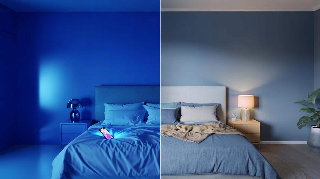
Blue is famous for being calm, but one highly saturated shade does the opposite in a bedroom. It looks stunning on a swatch and brutal at 2 a.m.
The paint looked glorious in the shop — a rich, electric cobalt that felt confident and grown-up — yet in the half-dark it turned the space sharp and chilly, the kind of blue that makes your duvet feel thinner and the floor colder underfoot. I lay there staring at my phone, the screen throwing more blue back across the wall, and it felt as if the whole room had decided to stay awake with me.
Blue can shout.
The shade that keeps you awake
Not all blues are made equal, and the one to dodge has a name: electric cobalt, the high-chroma, primary-leaning blue you see on team kits and neon signage. It’s dazzling at noon and restless by night. Under LEDs it reflects the punchiest slice of the spectrum straight back at your eyes, and that sizzle lingers.
In a bedroom, that means you get colour noise instead of quiet. Your eyes work harder to settle. Your brain stays on its toes.
A decorator friend told me about Jess, who painted her room a brilliant cobalt (think HEX #0047FF) after falling for a glossy catalogue shot. The first week, she slept in bursts and felt like it was January inside, even in June. She tried thicker curtains and a weighted blanket.
Nothing helped until she repainted to a muted blue-grey with a whisper of green. The difference was immediate: her heart didn’t race when the bedside lamp clicked on, and the room finally felt like night, not a sports bar at last orders.
Why does this happen? In colour theory, high-chroma hues push forward, especially at shorter wavelengths. Electric cobalt sits close to pure blue on the wheel, so it reads as vivid energy, not hush. In daylight it flares; at night it steals depth from corners and amplifies any blue in your bulbs or screens.
There’s a biological nudge too. Blue-heavy light cues alertness, and saturated blue paint bounces that energy around, even at low levels. The result is a bedroom that won’t unclench.
What to do instead
Shift the recipe. Choose blue with slack in it: lower chroma, softened with grey or green, the sort of tone that looks like mist more than ink. Look for words like “smoke”, “slate”, “sea”, “storm” on the label, and keep Light Reflectance around the middle — not cave-dark, not aquarium-bright.
Test big swatches on card and move them from wall to wall over a day. Swap in warm-white bulbs around 2700–3000K and see how the colour behaves at eleven at night. Let the room whisper back.
The classic trip-ups are tiny tester squares, shiny finishes, and painting every surface the same. Satin and gloss bounce glare; soft matt eats it and calms edges. People often ignore ceilings and skirtings, then wonder why the walls feel louder than planned.
Try tinting the ceiling two steps lighter than your wall, and keep trims neutral so your eye has somewhere to rest. We’ve all had that moment when the thing you loved in the shop turns prickly at home. Let’s be honest: nobody actually does that every day.
A colour consultant once told me that saturated primaries “keep moving toward you” after dark, while broken hues “lean back and let the room breathe.” I never forgot that.
“The colour of sleep isn’t silence; it’s softness. You want the blue of distant hills, not the blue of a billboard.”
- Go for blue-grey, blue-green, or dusty indigo rather than pure primary.
- Pick a flat or ultra-matt finish to reduce glare.
- Use warm-white lamps and dimmers to tame evening brightness.
- Bring in texture — linen, wool, raw wood — to warm the scheme.
Choose the blue of weather, not electricity. Your room will exhale.
Inside the colour: how cobalt tricks your senses
Electric cobalt looks clean because it lacks the “noise” of grey or green, yet that purity is what keeps your brain on duty. It heightens edges, sharpens contrast, and chills skin tones, which is why your face can look tired in the mirror and the room can feel a few degrees cooler than it is. Under winter light it reads icy; under summer light it glares.
I once loved it in a hallway and loathed it on a headboard.
There’s also the matter of modern lighting. Most LEDs spike in the blue range, phone screens too, and cobalt walls reflect that spike like a trampoline. Even a small notification flash can wake the space. Swap to warm-white bulbs and a muted blue, and the bounce becomes a murmur.
That’s the quiet your nervous system recognises as night.
A calmer palette is a kinder habit
Bedrooms aren’t galleries; they’re rituals in paint. When the colour backs off a touch, your bedding looks softer, wood warms up, and morning light arrives like a slow curtain instead of a slap. Go for long-term comfort over the first five minutes of wow.
These rooms hold our stray thoughts, our half-dreams, our piles of laundry that never quite make it to the basket. A high-voltage blue makes all that feel loud and exposed. A softened blue lets life be life.
If you adore blue — and I do — keep the drama in a throw, a print, or a lamp base. Keep the walls gentle. One tiny tweak in tone can buy you better **sleep** without costing the colour you love.
| Key point | Detail | Interest for the reader |
|---|---|---|
| Avoid electric cobalt on bedroom walls | High-chroma, primary-leaning blue bounces alerting wavelengths and feels cold | Prevents restless nights and harsh morning glare |
| Choose softened, broken blues | Blue-grey, blue-green, dusty indigo in matt finishes with mid-range LRV | Delivers a calm, cosy space that still reads as blue |
| Test with real light | Large swatches, warm-white bulbs, check at night and dawn | Stops costly repainting and regret from **bright** misreads |
FAQ :
- Which exact shade should I avoid?The electric, high-chroma primary blue often called “cobalt” or “brilliant blue” (think signage, sports jerseys). It looks punchy by day and wired by night.
- Is navy blue okay for bedrooms?Often yes. Deep, inky navies with a touch of grey or green feel grounded and cocooning, especially in matt finishes and warm light.
- What lighting works best with soft blue walls?Warm-white LEDs around 2700–3000K, layered with bedside lamps and dimmers. Keep screens out of sight or on night mode.
- What if cobalt is my favourite colour?Use it as an accent — a cushion, a frame, a small chair — where it pops without flooding your field of view at bedtime.
- How do I test paint without repainting twice?Roll two coats on A3 card, move it around for a full day-night cycle, and check with your actual bulbs. Your room’s light tells the truth.


Wow, this explains why my “bold cobalt” bedroom felt like a fridge at midnight. I swapped to a blue‑grey last month and actually slept. Thanks for the pratical tips on LRV and warm bulbs! 🙂